Today’s Theme: Minimalist Designs That Highlight Language Courses
Welcome to a calm, focused exploration of how minimalist design can make your language courses shine. We’ll show how less noise, more intention, and precise visual hierarchy help learners choose confidently. Tell us what you’d simplify first on your own course homepage and subscribe for weekly, minimal-first design prompts.
Cognitive Ease Over Clutter
When learners arrive, they are already decoding new words and expectations. Minimalist layouts reduce distractions, easing mental load so the brain can focus on the promise of progress. Comment with an example where less truly helped you learn.
White Space as a Teaching Tool
White space gives breathing room to headlines, key benefits, and entry points. It is not wasted; it is structural. Treat it like punctuation for your interface, guiding attention naturally. Subscribe for weekly exercises that practice spacing and rhythm.
Typography that Speaks
A restrained type system—two weights, one accent style—creates harmony. Strong headings introduce value; calm body text explains next steps. This mirrors language lessons: headline, example, practice. Share your favorite educational typeface pairings.
Homepage Layout: The Quiet Path to Enrollment
Single Hero, Single Promise
Open with one sentence that expresses outcome, audience, and time horizon. Pair it with a single, descriptive button. Let supporting details wait below the fold, so curiosity naturally continues. Ask readers to test your headline aloud.
Focused Navigation, Fewer Choices
Limit top navigation to essentials: Courses, Levels, Placement Test, and Contact. Fewer items reduce decision fatigue, helping learners progress. Invite your audience to suggest one link to remove and one to rename for clarity.
Above-the-Fold Storytelling
Support the hero with a concise subheader and an unobtrusive graphic. Avoid carousels. Present one narrative thread that answers why this course, why now, and for whom. Encourage readers to share a screenshot of their current fold.
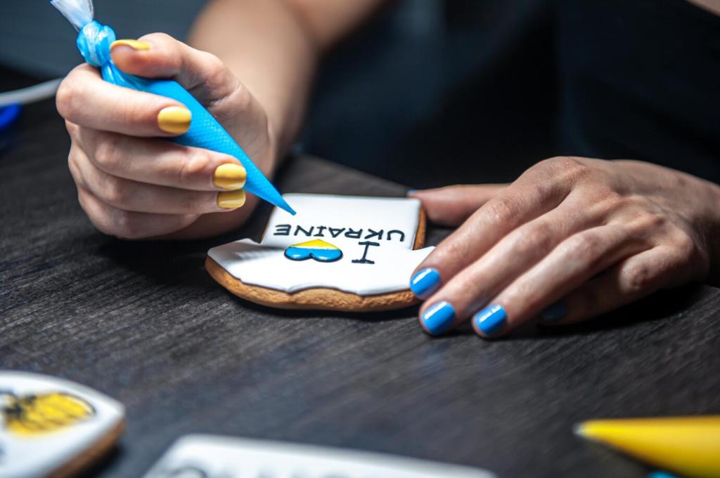
Use photos that show real learning: a student completing a placement test, a tutor correcting pronunciation, a small group practicing. Avoid generic stock smiles. Invite readers to share the most honest image from their classroom.
Imagery and Iconography for Language Courses
Icons can clarify tense drills, speaking practice, or listening labs. Keep stroke thickness consistent and labels explicit. If an icon needs a legend, it likely needs revision. Ask your audience to vote on two candidate icon sets.
Content Strategy: Say Less, Mean More
Pair outcomes with specificity: “Speak confidently in weekly meetings” beats “Improve your English.” Minimalist copy is precise, brave, and respectful. Invite readers to rewrite one headline using outcome, audience, and timeframe.
The homepage carried a carousel, five banners, and overlapping promotions. Learners bounced between tabs, unsure where to start. The team felt pressure to show everything at once, and nothing stood out.
They chose one promise, one button, and a cleaner menu. Course details became scannable blocks, with a calm placement test entry. A single accent color guided attention, letting copy breathe and teach.
Visitors now land, read a focused headline, and begin placement without hesitation. The page feels respectful and trustworthy. The school reports calmer conversations and more thoughtful inquiries. What would your first simplification be?